Candle Emporium
Enhancing a local candle shop experience.
Project Type : Mobile first E-commerce
My Role : UI/UX Designer
Duration : 2 weeks
The brief, In brief
The Brief
Candle Emporium, located in downtown Toronto, is a boutique candle store known for its artistic, high-quality designs and as the largest retailer of premium candle brands. While they excel in craftsmanship and sustainability, their outdated website and poor user experience hinder online growth and profitability
Task
Redesign the website to Improve the online shopping experience by creating a visually appealing, intuitive website with a streamlined checkout process, boosting customer satisfaction and driving business growth.
Research
To kick off the process, I performed a heuristic evaluation through my favorite Abby’s method on the current website to identify key areas in need of improvement laying the foundation for an informed design solution.
Research Goal
“To understand the target users' needs, pain points, and shopping behaviors, identify key usability challenges, and validate design solutions to create a user-friendly e-commerce experience that aligns with business goals and enhances online engagement and conversions.”
Research Method
I conducted four research methods to deeply understand user needs, pain points, and behaviors.
Heuristic Evaluation
Competitive Analysis ( Feature Inventory )
Comparative Analysis ( SWOT )
User Interviews and Testing
Heuristic Evaluation
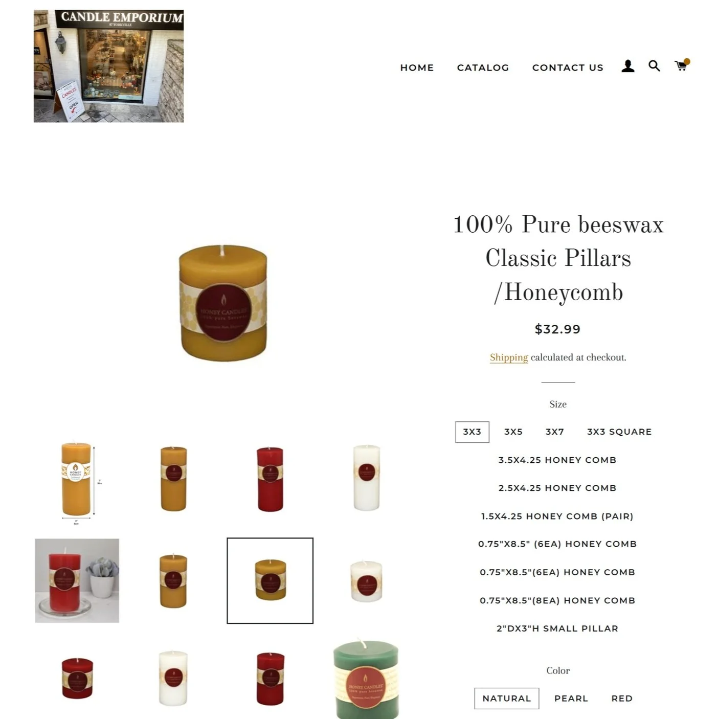
After conducting a heuristic evaluation, I found that Candle Emporium lacks a strong brand identity, clear product descriptions, intuitive filtering options, and a well-structured layout, making navigation difficult and impacting the overall user experience.
Existing site
Home page
Product Category
Product Detail page
C&C Analysis
After evaluating the website, I explored competitors with similar business models to analyze their features, website layouts, and offerings. This helped me identify industry standards and gather insights to incorporate into my design solution.
Feature Inventory
Candle Emporium Lacks basic features - Category, sub category, reviews and ratings
Missing engagement and personalization tool like Wishlist, gift options to enhance shopping experience
No focus on exclusive collections - seasonal collection to attract customers
SWOT Analysis
I summarized the area on strength, weather and what are the opportunities for Candle emporium after analsing it’s competitor with simialr business model, Candle Emporium can offers sustainable and eco friendly products which is high in demand, so highlighty those will make it stand out from the market
Strength
Affordable pricing attracts a broader audience compared to luxury brands
Focus on eco-friendly products
Supports small businesses and South
African artists, adding a unique brand story.
Weakness
Limited brand recognition and storytelling.
Lack of engaging storytelling to emotionally connect with customers.
Basic online experience with missing features impacting ecommerce business.
Opportunity
Improve e-commerce with better visuals, navigation, and impactful branding.
Highlight sustainability and expand product offerings.
Threats
High competition from both luxury and affordable brands in the candle market.
User Preference for more easy to navigate online experience
User Interview
I conducted user interviews and usability testing on the existing website to gain insights into shopping habits and understand what users prioritize when browsing a candle website.
This process challenged my initial assumption, revealing ——-
Users not only value easy navigation but also prefer to smell candles in person before making a purchase.
Key Insights
4/5 User feel review and ratings really help them with the decision
5/5 User like to smell the candle's before buying
3/5 User often look for product online because its fast and easy and when they don’t have access to the store
User Persona
Based on the findings from user interviews I developed the following persona. It reflects the key motivations, behaviors, goals, and frustrations of our target users, serving as a foundation for designing user-centered solutions.
Meet Emma
Emma’s main frustration
Emma finds it difficult to make confident purchase decisions due to vague product descriptions, lack of detailed visuals or reviews, and cluttered website designs that disrupt her experience.
How might we help Emma with..
Incorporate filter to find desired product
Discover fragrance effortlessly
Transparent experience while investing
Ideating it out!
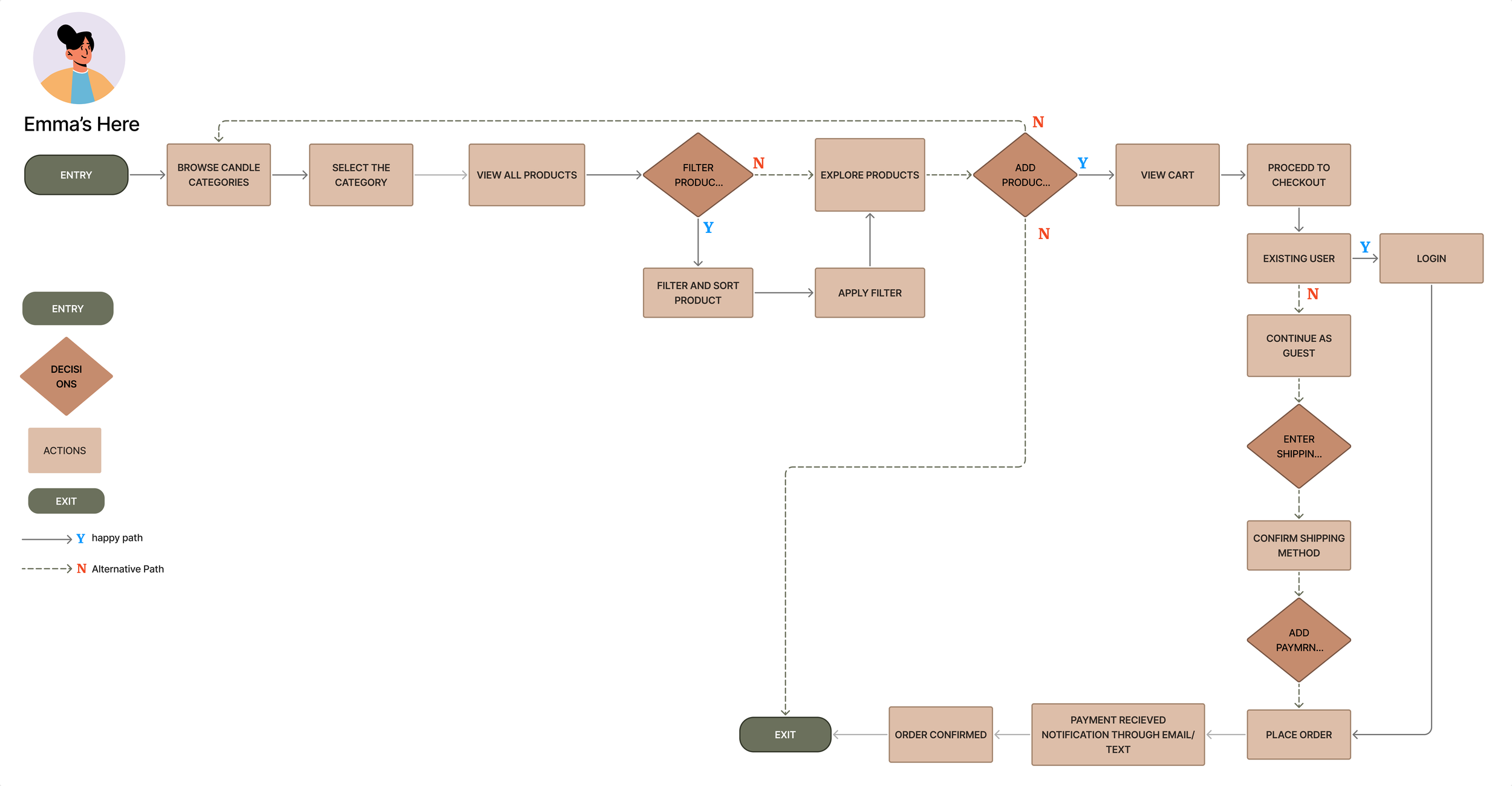
Before designing the screens, I restructured the user flow to simplify product discovery and create a seamless checkout process, ensuring a more intuitive and satisfying user experience.
User flow for exploring a candle and placing the order.
User Flow
Low-fi to Mid fi Screens
Usability testing 1 on Mid-Fi
I asked 5 User to perform 2 task on Mid-fi screen to understand, any indirect path, miss click, time on task and overall user experience.
Task 1 : Explore candle and choose any fragrance candle and add to cart.
Task 2 : Proceed to checkout
Among the five users tested, four successfully completed the task without difficulty.
However, two users encountered challenges:
one experienced confusion with the label naming in the navigation.
while another expressed hesitation due to the absence of a payment confirmation step prior to the final payment.
These insights were carefully considered, and incorporated into the final product.
Branding and color palette
Since Candle Emporium did not have a defined color theme, I selected black as the Primary CTA color, complemented by a contrasting palette to ensure visibility and impact. For the overall website design, I proposed an earthy color palette to evoke calmness, freshness, and an aromatic appeal. Earthy tones, associated with nature, warmth, and tranquility, perfectly encapsulate the essence of candles, creating an inviting and cohesive user experience that aligns with the brand's identity.


