LightHouse Investments
Hedge fund quant strategies for everyone..
Project Type : Apprenticeship
My Role : Lead UX Designer
Duration : 3 weeks
The brief, In brief
The Brief
LightHouse aims to democratize quantitative trading by making hedge fund-grade strategies accessible to everyone, regardless of their financial background. However, their early MVP struggled with key challenges that hindered usability and accessibility, particularly for users with limited financial knowledge.
Task
To enhance the performance, usability, and accessibility of our early MVP product by employing UX research methods.
Addressing these challenges by enhancing clarity, engagement, and confidence is key to ensuring a successful launch and adoption.
Hypothesis
Our early assumptions concluded with…
To design the platform that features accessible and intuitive navigation, simplifying onboarding process with clear explanation of strategies for new users and ease of use designed to cater all financial literacy level.
Research
In order to design something of value that truly impacts we have to know what people value!
We have to know:
What users look for when using investment platforms
What makes them stop using these platforms and what challenges they face.
Research Goal
“To understand the target users' needs, pain points, and behaviors, identify key problems to solve, and validate the effectiveness of design solutions to create a user-centered platform that meets business objectives and delivers a seamless investment experience.”
Research Method
We conducted six research methods to deeply understand user needs, pain points, and behaviors. Among them, three key methods had the most impact on shaping design decisions and aligning solutions with user expectations.
Heuristic Evaluation
Screener Surveys
C&C Analysis ( Feature Inventory )
User Testing
Usability Testing
C&C Analysis (Element Analysis)
Heuristic Evaluation
We took Abby Method of heuristic analysis which outlines a checklist of 10 heuristic principles; Findable, Accessible, Clear, Communicative, Useful, Credible, Controllable, Valuable, Learnable and Delightful.
Severity Rating
0 = Major Problem
1 = Medium Problem
2 = Minor Problem
3 = Major Meets Best Practices
C&C Analysis
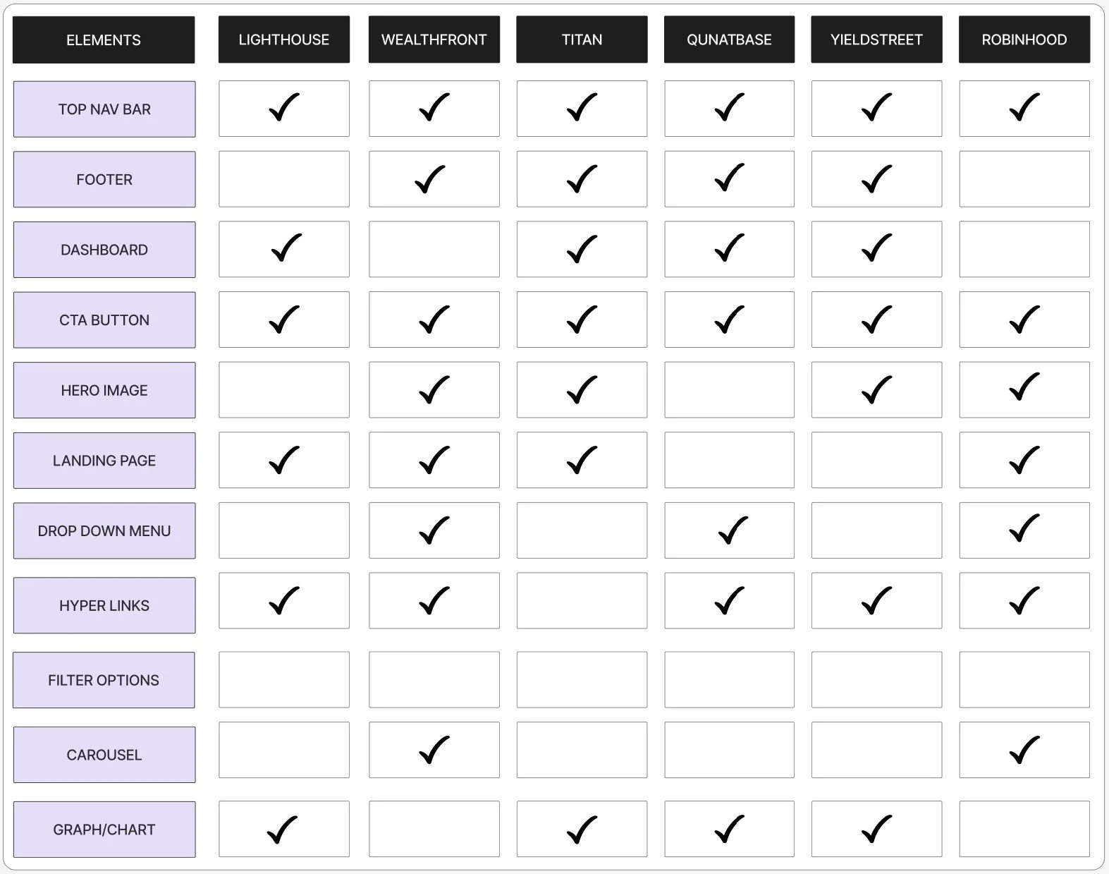
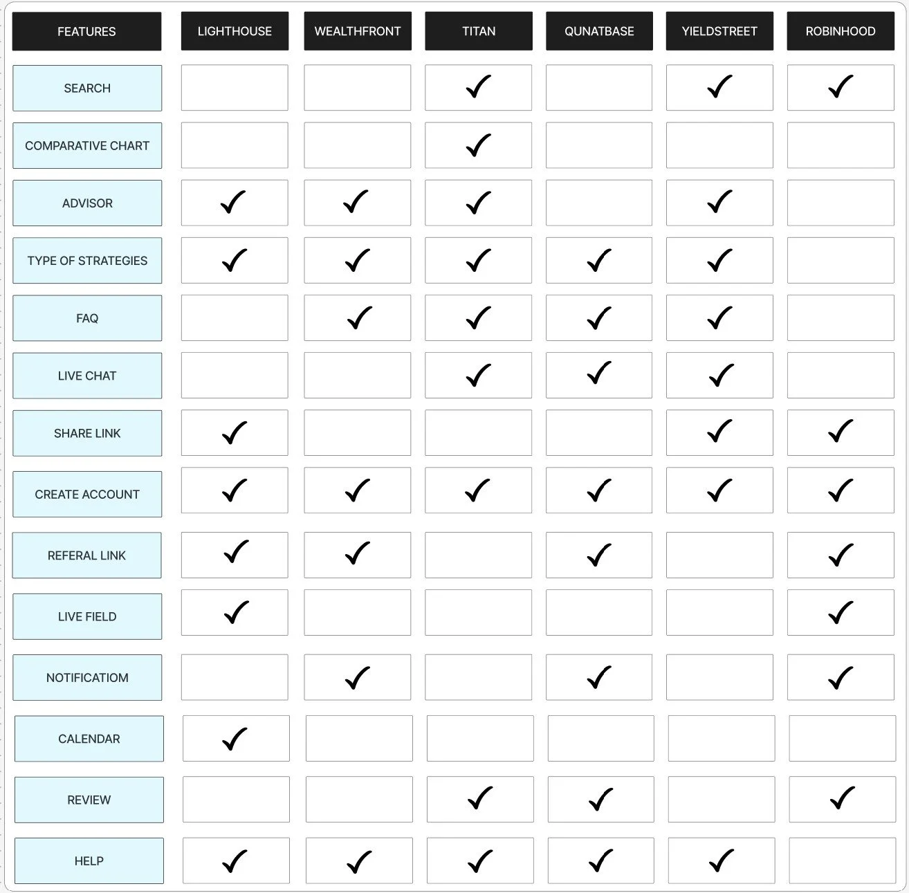
We conducted feature inventory and element analysis of competitor companies, including Quantbase, Robinhood, Wealth front, Titan, and Yieldstreet to identify common functionalities across these platforms, providing valuable insights into industry standards and benchmarks that align with user expectations for an app or website.
Element Analysis
Feature Inventory
After analyzing our competitors we found these key Insights that can be implemented in LightHouse to meet the standards.
Essential Features: Top navigation, footer, dashboard, clear CTAs, and graphs for usability and decision-making
Improvements Needed: Add search, live chat, comparative charts, FAQ, and help sections.
Engagement Boosters: Advisor guidance, live feeds, notifications, and easy onboarding tools.
Credibility: Leverage reviews and share links for trust-building.
User Interview
We interviewed 5 users to understand there investment journey, goals, needs, pain points and behavior.
We wanted to learn:
What inspires users to start their investment journey?
What type of investments users do - Short term, long term ?
Do they prefer managing portfolio independently or seek advice?
What are there biggest frustration when it comes to investment?
Are there any specific features or tools they look for in investment platform?
View in depth analysis Here
Key Insights
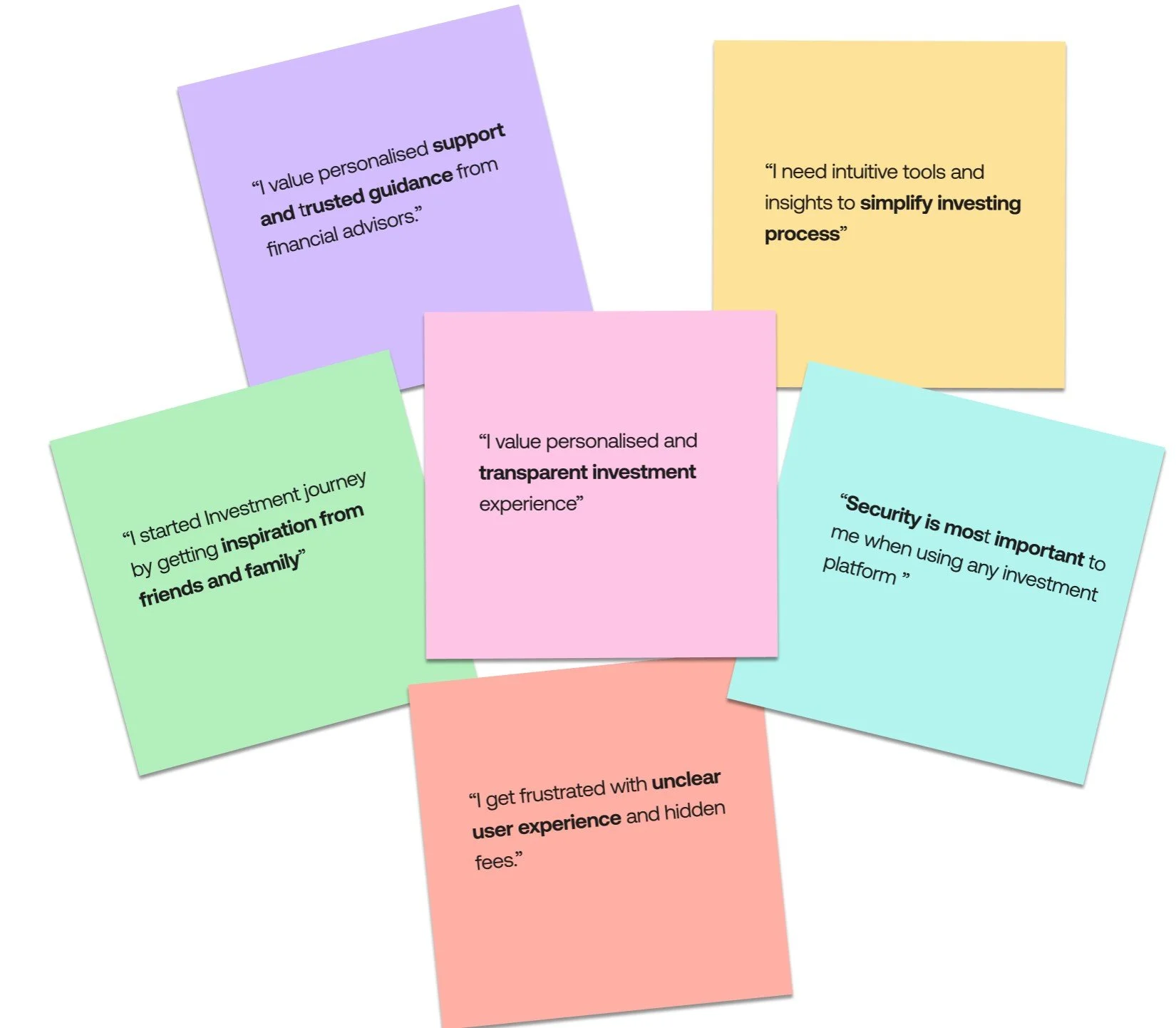
4/5 Users needs tools that can simplify Investing and clear user interface.
5/5 Users Prefer high security features when using investment platform
3/5 Users seek for guidance and support when doing investments
User Persona
Based on the findings from user interviews and the proto-persona provided by the client, we developed the following persona. It reflects the key motivations, behaviors, goals, and frustrations of our target users, serving as a foundation for designing user-centered solutions.
Meet Ivy the Investress
Ivy’s main frustration
Ivy feels overwhelmed by too many investment options, making decisions difficult. She needs a clear, intuitive system with transparency and guidance for confident investing."
How might we help Ivy with..
guidance and access to support
Features that simplify complex data
Strong security measure that builds trust
Transparent experience while investing
Ideating and drawing it out
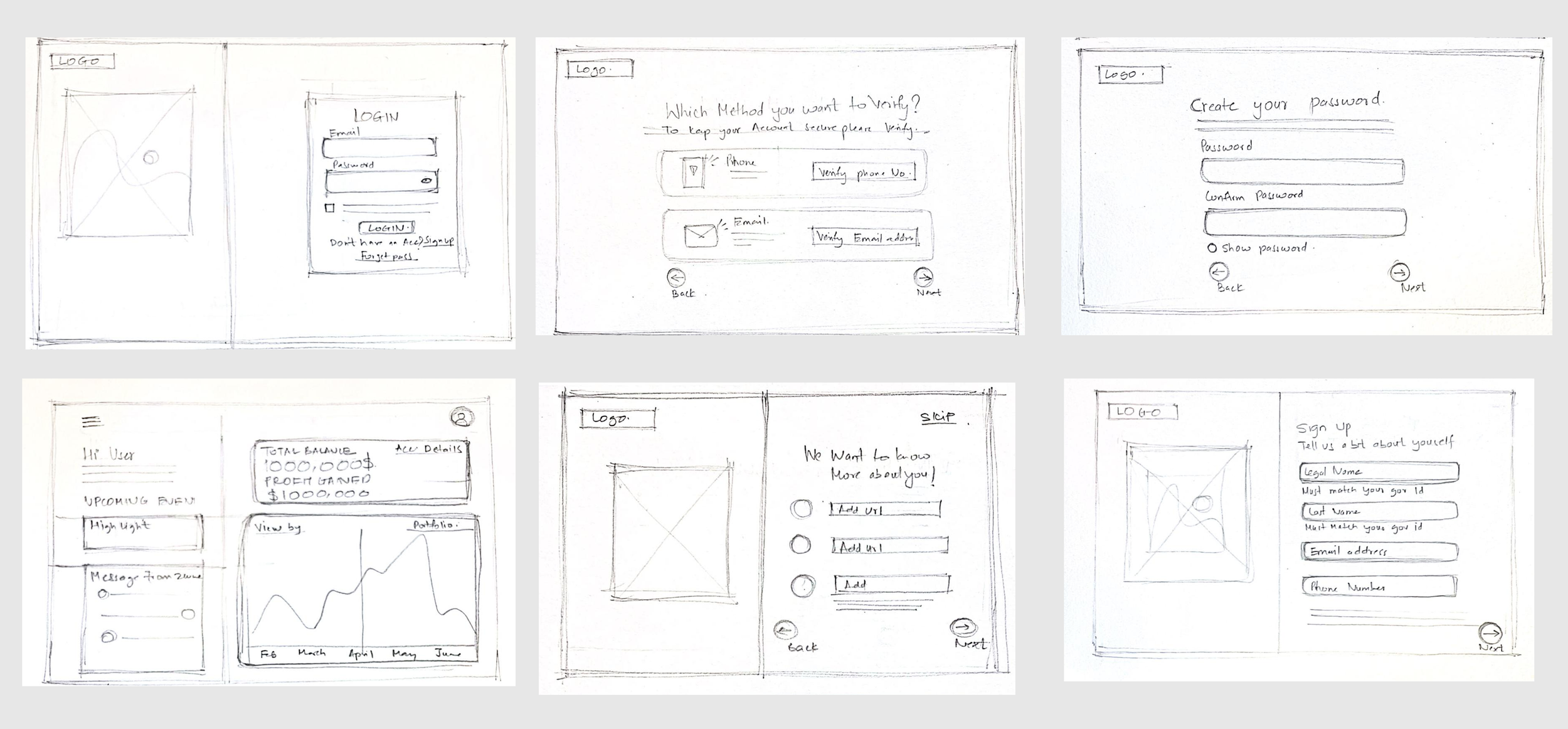
We started from sketching different ideas to moving them to Mid-fidelity wireframes to explore different layouts and navigation options.
These wireframes focused on 3 major flows
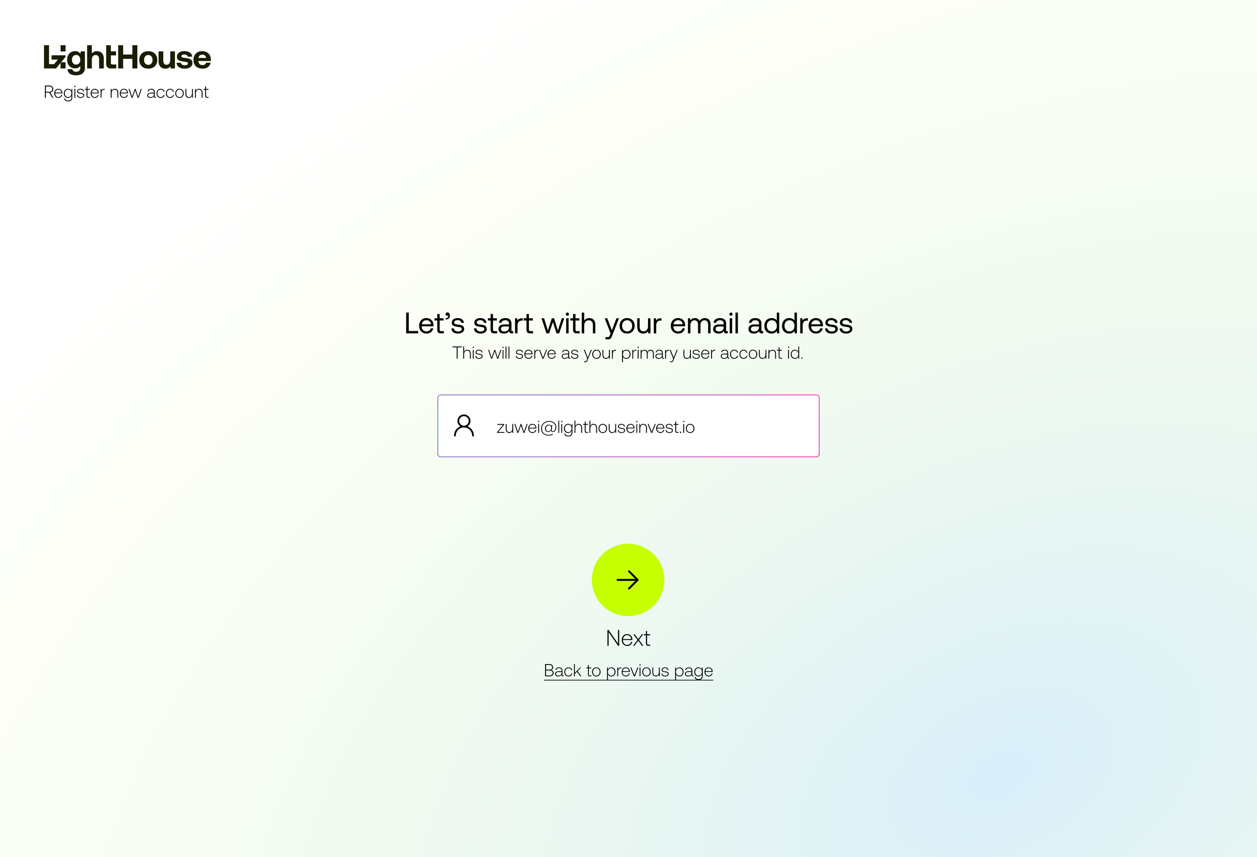
New user Onboarding - signing up/creating a profile.
Opening investment account and linking bank account
Exploring strategies and starting investment journey
Low-fi screen
Total screen - 56
Mid-fidelity screen
Usability Round 1 - Mid-Fi
To enhance our product's user experience, we conducted two rounds of usability testing—one with mid-fidelity and another with high-fidelity prototypes. During the testing, participants were asked to complete four core tasks critical to the product's
These tasks allowed us to identify usability pain points, measure task efficiency, and understand user satisfaction
Key Takeaways
Sign-Up: 100% success; improve efficiency to reduce time variability.
Set Up Investment Account : 80% success; add clearer guidance to avoid indirect paths.
Link Bank Account & Make Investment: 100% success; processes are smooth and intuitive—no changes needed.
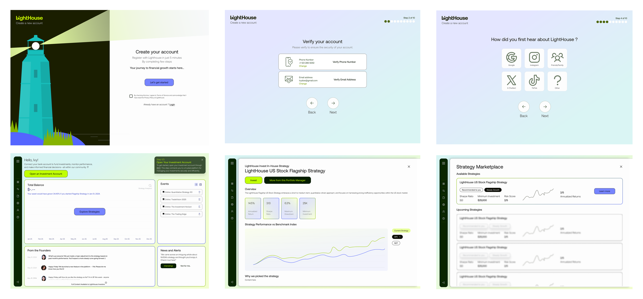
Hi-Fidelity Screens
"The high-fidelity phase elevated refined wireframes into meticulously polished designs, seamlessly integrating user feedback to enhance both usability and aesthetics. Each iteration prioritized streamlining the user flow, clarifying the interface, and crafting interactions that feel natural and intuitive."
Usability Testing 2 - Hi Fi Design
User Feed back
Sign-Up: 100% success; task performed efficiently on both devices with a 1:44 average completion time.
Task 2,3 & 4: Achieved 80% success. Two users faced navigation issues on iPads due to non-responsive design, while another had technical issues, extending three of five test sessions.
Gained additional valuable insights from users, such as implementing a secure login option using Google or Apple.
Prototype
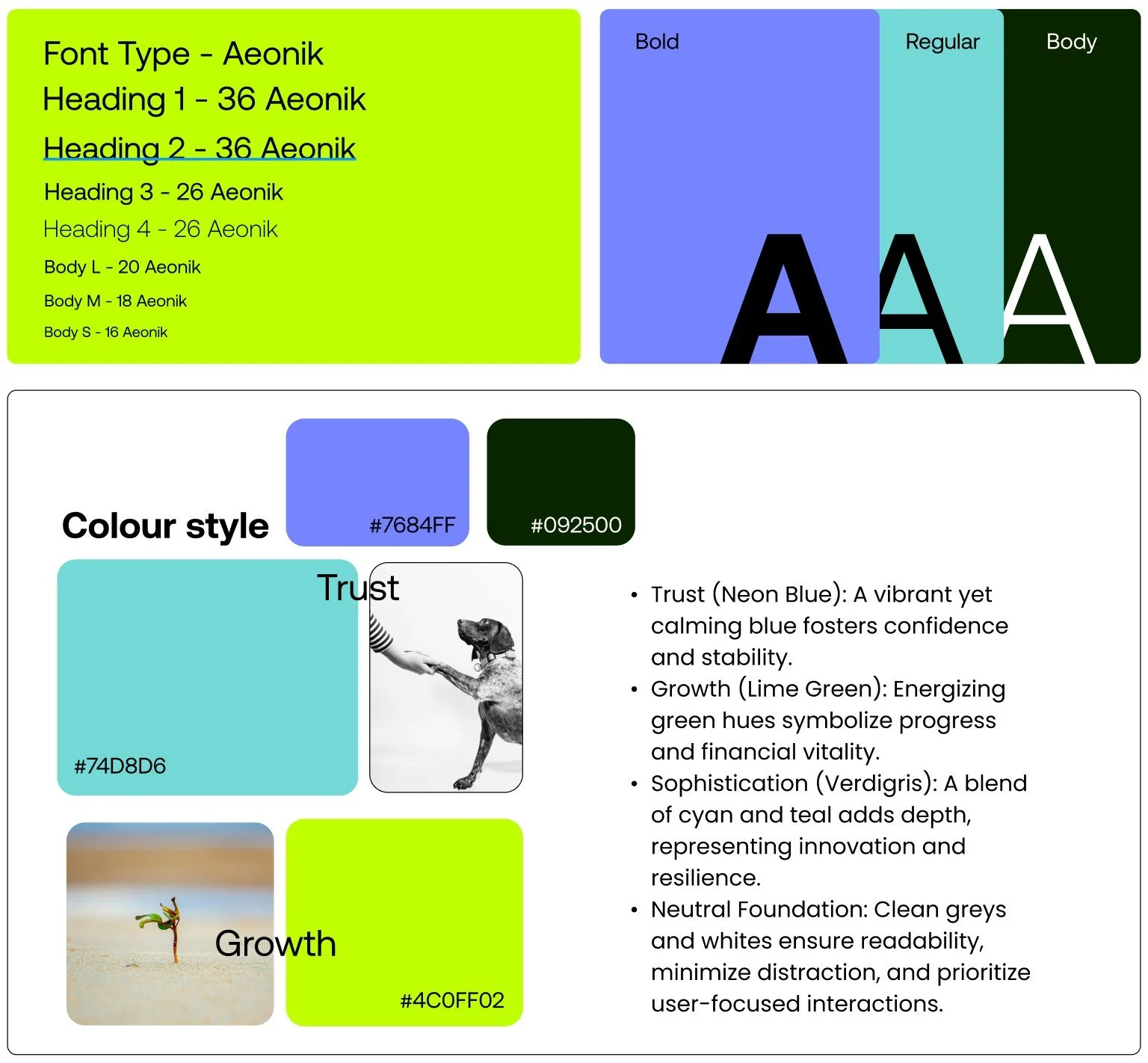
Color Palette
Our color palette aligns with the client’s green logo and the existing Lighthouse style guide, refined to enhance accessibility and user experience. By thoughtfully adjusting color opacity and gradients to meet WCAG standards, we ensure optimal readability while retaining modern, fresh aesthetics. The palette anchors lighter tones of cyan, blue, and grey to evoke clarity and balance, while reflecting core brand values:
The Before and The After
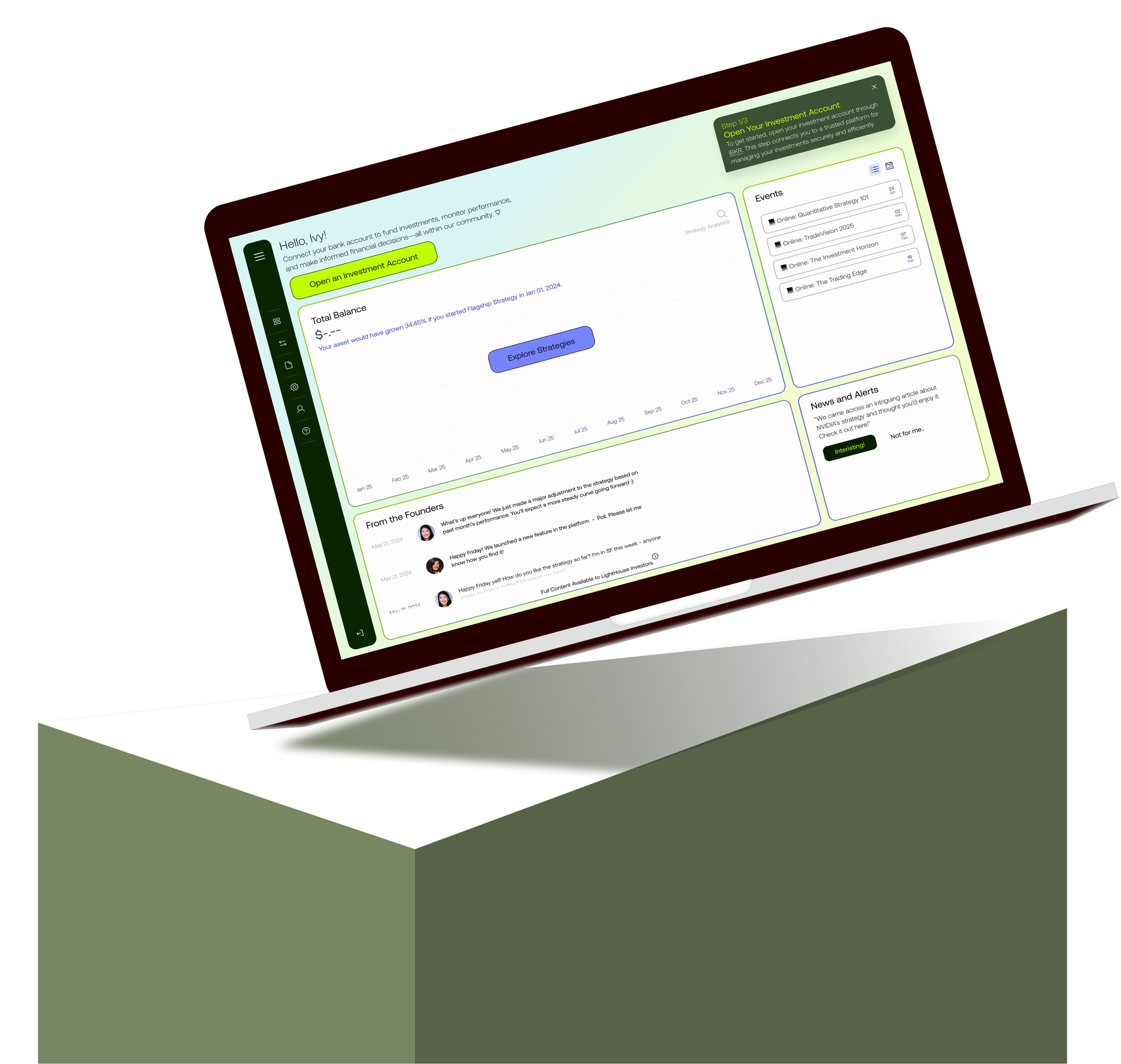
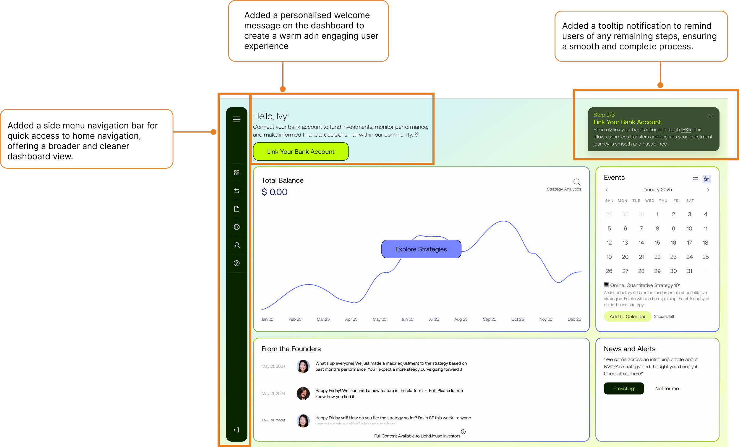
Highlighting few UI changes added to the screen to increase accessibility and usability of the platform.
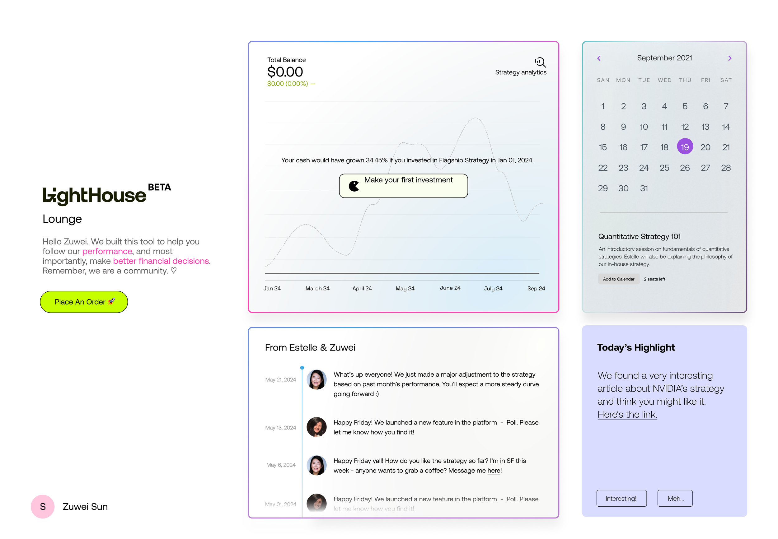
Before
After
Handing of MVP
Finally, it was time for handoff after 3 weeks of work.
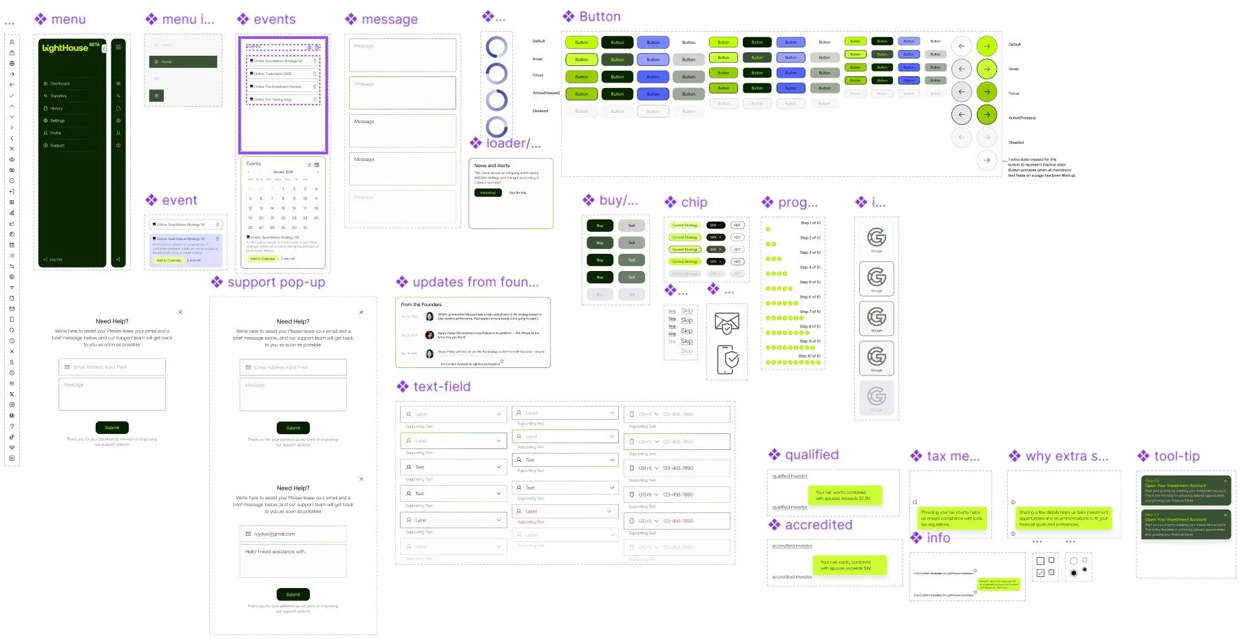
Handoff included a blend of custom UI components, Hi- Fi prototype and an overall project report.
Design system and components
